
Sprint Burndown and BurnUp Chart
The explicit goal of Agile and Scrum is to deliver small iterations of working software quickly with each iteration incrementally building value over the previous iteration. The development team should be building, testing, deploying, and continuing that flow from one Sprint to the next. Because Agile and Scrum approach delivering software in a different way, you may have questions about how to measure success. How can you measure progress? How do you know how well you are doing against team expectations? Two mechanisms within Agile that can help are the burndown and burnup charts. These are two essential tools development teams utilize to track and communicate progress on Sprints internally and externally to stakeholders.
The Concept of the Charts
The concept behind both the burnup and burndown charts is to quickly capture the points in the Product Backlog that can be used to show progress completed, or work remaining, over a defined period - typically a two-week Sprint cycle. The two charts are commonly used with Agile and Scrum software project management organizations to gather data that will allow them to complete projects on time and within budget.
Creating a Burndown Chart

You would typically use the burndown chart internally with the Scrum team. It is a visual tool to help them gauge their progress in completing Sprint Goals. Creating a burndown chart starts with a complete task breakdown, including estimates of how much time is required to finish each task. The chart can be created easily in an Excel spreadsheet. All you need is a simple data table with defined tasks, a time estimate for each task, and the estimated effort required to complete each task (hours available divided by number of days). The team should then be tracking progress daily and updating the data table regularly.
The burndown chart is a measure of what is remaining throughout a Sprint. It is a chart that horizontally tracks progress. You start at the top left corner of the chart, at the top of the Y-axis. At this point, you have all User Story points to be completed in the Sprint. As you complete User Story points, over a set period, you begin to, well... burn down.
If one day has gone by, you move one day to the right on the X-axis and drop down on the Y-axis to show how many points remain. You continue to do this throughout the Sprint, with the goal being to show incremental, steady progress over the Sprint, and to have no User Story points remaining at the end.
Benefits of a Burndown Chart
The burndown chart provides great data for retrospectives. If the burndown is going up, then work is being added in the Sprint. If it’s flat and then drops at the end of the Sprint, your User Stories may be too big. In any case, it tells a story about the Sprint, the causes of which the team can dive into the retro. Burndown can also be hours/count of tasks the team creates to decompose a story into working actions. Burndown charts are useful because they can alert the team to potential bottlenecks and show whether or not they’re on track to meet deadlines. It also acts as a good motivator by illustrating where the team has found success and showing their collective achievements.
Burndown charts are not great tools to use with stakeholders. Stakeholders are there to find out what you have completed during the Sprint and provide feedback. They represent the users of your software. However, what often ends up happening is the stakeholders look at the data and want the team to get more work done in the same amount of time, all the while failing to acknowledge the things that slowed the team down in the first place. Not only that, but by simply looking at the raw data without having been actively involved in the Sprint, they won’t know anything about task complexity, whether one team had fewer members than another, and other team-specific issues. It is generally better to leave the burndown charts in the hands of the engineers because they know how much work they can do and what they need to fix over the course of each Sprint.
Looking at a Burnup Chart
A burnup chart is very similar to a burndown chart; it’s used to show how many story points are in the Product Backlog versus how many we’ve completed to date. It also shows how much work remains in the project version or release. The burnup chart is helpful to share with stakeholders, but not at the Sprint level. By involving them at the Sprint level you run the risk of them becoming too involved. They could get caught up in the minutiae of every product backlog item or every software feature. Stakeholders care about the Sprint outcome. They want to see that the team is adding value to the product at every step of the development process. Keep them in the loop by providing the burnup chart at the end of the Sprint.
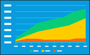
In the burnup chart, you start at the bottom left corner, where the X- and Y-axis meet. You then begin to track time on the X-axis and track progress on the Y-axis, moving in an upward diagonal direction as you complete User Story points. The goal should be, by the end of the Sprint, to be at the top right corner of the chart with all User Story points completed. You can also use the burnup chart to track functionality versus User Story points.
Burnup charts are particularly useful for showing the total scope of a release and how the Sprint impacted the larger release goal. In cases where more work was required than was originally anticipated, or when customers suddenly demand extra features, the burnup chart will show the increase in scope, team velocity and actual progress made by the team. The burnup chart can help prevent disruptions to team workflow and make estimations about the amount of work more accurate. Any changes made to the budget or the scope of work are clearly visible at the top of the chart and the team can adjust accordingly.
The Charts Work Together
You can have a burndown and burnup chart on the same Sprint. The burndown chart may not make it look like a team made a lot of progress at the Sprint’s mid-point, especially if it was working through a large User Story. Burndown by task is an option that smooths out these gaps. The burnup chart can complement the burndown chart by showing a more complete picture. The burnup chart can also track scope. You’ll be able to see if things were added or removed along the way to help you gain more insight into the burndown chart.
The burndown and burnup charts are powerful tools to use in Agile and Scrum. When you make use of metrics tracking such as these, you’ll gain better insight into what has already been completed, as well as what work is still outstanding. You can use that knowledge to help improve the team and demonstrate efficiency improvements in development teams as they mature.